Behind the Numbers: How We Measured Population Growth and Spatial Hot Spots
methodology
population
spatial-analysis
A plain-language explanation of the data sources, calculations, and analytical methods behind our first Data Brief on population growth in Cabarrus County, including how the Getis-Ord Gi* hot spot statistic works and what it tells us.
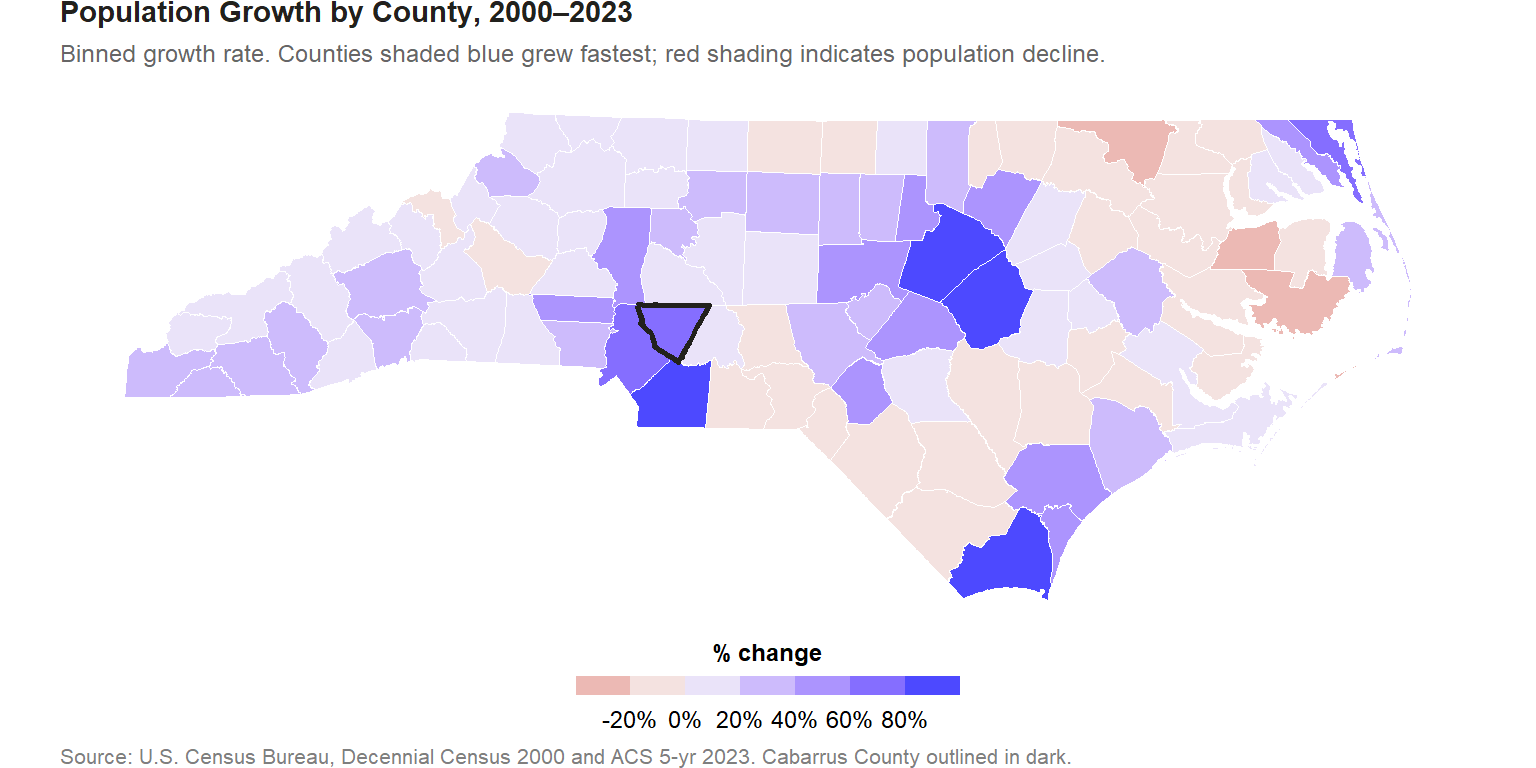
Our first Data Brief documents one of the most striking demographic stories in North Carolina: Cabarrus County’s 76% population increase between 2000 and 2023, ranking 5th out of 100 counties statewide. This post explains the data behind that finding, how the growth rate was calculated, and (most importantly) how the Getis-Ord Gi* hot spot analysis works and what it proves.
Where the data come from
The brief uses two sources, covering the beginning and end of a 23-year window.
The 2000 baseline comes from the Decennial Census (Summary File 1, table P001001, total population). The decennial census is a full enumeration of every person in the United States, conducted every ten years. It is the gold standard for population data: no sampling, no modeling, no uncertainty.
The 2023 endpoint uses the Census Bureau’s American Community Survey (ACS), 5-year estimates ending 2023. The ACS is a continuous survey that samples approximately 3.5 million households per year. The 5-year estimates pool five years of survey responses to produce reliable estimates for small geographies. Unlike the decennial census, ACS estimates include a margin of error.
Both series are accessed through the tidycensus R package, which provides a consistent interface to the Census Bureau’s APIs and published data files.
How the growth rate was calculated
The percentage growth rate is the same formula used in any before-and-after comparison:
\[\text{Growth Rate} = \frac{\text{Population}_{2023} - \text{Population}_{2000}}{\text{Population}_{2000}} \times 100\]
For Cabarrus County:
\[\frac{231,262 - 131,063}{131,063} \times 100 = 76.5\%\]
This is an unadjusted rate that reflects raw head-count growth over 23 years, not an annualized compound rate. The advantage of the simple rate is interpretability; the disadvantage is that it makes shorter and longer time windows hard to compare directly. The NC county median growth rate over the same period was 9.7%.
The map immediately shows the spatial pattern: growth is concentrated in the Piedmont Triad and Charlotte metro, while many coastal plain and mountain counties have declined or stagnated. This geographic clustering motivates the hot spot analysis.
What the Getis-Ord Gi* statistic measures
The choropleth above shows where growth happened, but it does not distinguish between two very different situations:
- A county that grew quickly while its neighbors stagnated (an isolated spike)
- A county that grew quickly and whose neighbors also grew quickly (a true spatial cluster)
These situations look identical on a simple choropleth but have very different implications. An isolated spike might reflect a single large development or a data quirk. A spatial cluster suggests a self-reinforcing regional dynamic, the kind of growth that attracts further growth.
The Getis-Ord Gi* statistic, introduced by Getis and Ord (1992) and extended in Ord and Getis (1995), tests for this clustering formally. For each county \(i\), it computes:
\[G_i^* = \frac{\sum_{j} w_{ij} x_j - \bar{x} \sum_{j} w_{ij}}{S \sqrt{\frac{n \sum_{j} w_{ij}^2 - (\sum_{j} w_{ij})^2}{n-1}}}\]
Where: - \(x_j\) is the growth rate of county \(j\) - \(w_{ij}\) is the spatial weight between counties \(i\) and \(j\) (1 if neighbors, 0 otherwise; the Gi* variant includes county \(i\) itself) - \(\bar{x}\) is the mean growth rate across all counties - \(S\) is the standard deviation of growth rates - \(n\) is the number of counties (100 for NC)
The result is a z-score for each county. A large positive z-score means the county and its neighbors collectively have much higher growth than would be expected by chance. A large negative z-score means a cluster of slow or declining counties. Z-scores that fall near zero indicate no meaningful spatial clustering.
Spatial weights: who is a neighbor?
The Gi* requires a definition of “neighbor.” We use queen contiguity: any county that shares at least one boundary point with county \(i\) is its neighbor. For Cabarrus County, this includes Mecklenburg, Rowan, Stanly, Union, Iredell, and Kannapolis-area counties. The intuition is geographic: if growth is truly a regional phenomenon, it should show up in counties that share borders, not just counties that are abstractly “nearby.”
The computation uses the spdep R package (Bivand & Wong, 2018), which implements the Gi* statistic with a binary spatial weights matrix (style = “B”) and self-inclusion.
How to read the significance thresholds
The z-score is compared against the standard normal distribution to assess statistical significance:
| Z-score threshold | Significance level | Interpretation |
|---|---|---|
| ≥ 2.576 | 99% | Hot spot (very high confidence) |
| ≥ 1.960 | 95% | Hot spot (high confidence) |
| ≥ 1.645 | 90% | Hot spot (moderate confidence) |
| −1.645 to 1.645 | n/a | Not significant |
| ≤ −1.645 | 90% | Cold spot (moderate confidence) |
| ≤ −1.960 | 95% | Cold spot (high confidence) |
| ≤ −2.576 | 99% | Cold spot (very high confidence) |
Cabarrus County’s z-score of 3.45 places it in the Hot Spot (99%) category, meaning there is less than a 1% probability that this level of clustered high growth would occur at random.
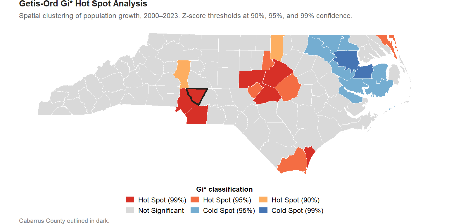
The hot spot map reveals that Cabarrus is not an outlier: it is part of a contiguous cluster of high-growth counties anchored by Mecklenburg. This is a regional phenomenon driven by Charlotte’s economic expansion and outward residential growth, not a Cabarrus-specific story.
Annual population time series
The story’s year-by-year chart tracks Cabarrus County’s population for every year from 2000 through the most recent estimate. Constructing a continuous annual series required three separate data sources, because the Census Bureau’s Population Estimates Program (PEP) changed its API structure after the 2020 Census and does not support pre-2015 data through its current API endpoints.
Decennial anchor years (2000, 2010, 2020). The full-enumeration decennial census counts serve as fixed reference points at the start, midpoint, and recent end of the series. These are the most reliable population figures available: no sampling, no modeling, no uncertainty interval.
2001-2009 (intercensal estimates). After each decennial census, the Census Bureau publishes a revised intercensal file that reconciles its annual estimates with both surrounding decennial counts, removing the upward drift that accumulates in the PEP series. The 2001-2009 figures come from the post-2010 intercensal county totals file (co-est00int-tot.csv), downloaded directly from the Census Bureau’s public archive. These estimates were revised backward after the 2010 census to be internally consistent with both the 2000 and 2010 counts.
2011-2019 (post-2010 PEP annual estimates). Annual estimates for this period are retrieved through the tidycensus package using get_estimates() with the 2019 vintage and time_series = TRUE. This returns July 1 population estimates for 2011-2019 in a single API call. If the API call fails, a CSV fallback downloads the same data from the Census Bureau’s 2010-2019 county totals file.
2021-2023 (post-2020 PEP annual estimates). After the 2020 decennial census, the PEP program restarted with the 2020 count as its new baseline. The API structure changed: get_estimates() now requires separate vintage and year arguments, and the time_series parameter is not supported for post-2020 data. Each year is retrieved individually using the most recent available vintage (2023, falling back to 2022 for earlier years). The 2020 decennial count is used for the 2020 anchor directly, without relying on the PEP.
The final table (cabarrus_population_annual) combines all segments, deduplicates at decennial years (where both the decennial count and a PEP estimate exist), and adds year-over-year population change and percentage growth rate columns. The result is a 24-row series covering 2000 through 2023.
The year-over-year growth rate bars in the story’s bottom panel are computed as \((\text{Pop}_t - \text{Pop}_{t-1}) / \text{Pop}_{t-1} \times 100\). The period average is the mean of those annual rates across all years with a defined prior-year baseline.
Census tract boundary crosswalk
Comparing tract-level populations between the 2010 and 2020 censuses requires resolving a boundary mismatch. The Census Bureau periodically redraws tract boundaries to keep tract populations within a target range, splitting high-growth tracts and occasionally merging others. A direct comparison of 2010 tract totals to 2020 tract totals would conflate boundary changes with actual population changes.
The conventional workaround is areal interpolation: distribute a source zone’s population to target zones in proportion to the share of area that overlaps. This approach introduces error wherever population density is spatially uneven within a source zone, which is common in suburban counties where dense subdivisions, commercial corridors, and undeveloped land can all fall within a single tract.
We use a more accurate block-level aggregation instead. Census blocks are the smallest tabulation geography; they are designed to be internally homogeneous in character and small enough that a single block rarely spans a major density transition. We assign every 2010 census block to its corresponding 2020 tract by centroid: the block’s center point is matched to the nearest 2020 tract boundary using st_nearest_feature from the sf package. Summing those block-level 2010 populations by 2020 tract produces a 2010 population baseline expressed in 2020 geography, enabling a direct comparison.
The st_nearest_feature join rather than st_within guarantees that every block receives exactly one tract assignment, handling the small minority of centroids that fall precisely on a shared boundary. The residual approximation is limited to the rarest cases: 2010 blocks whose actual boundaries straddle a 2020 tract line and whose population is genuinely ambiguous. For a suburban county like Cabarrus, this affects a negligible share of total population.
The block-level crosswalk data are stored in raw_cabarrus_blocks_2010, and the final tract comparison table (in 2020 tract geography) is stored in cabarrus_tract_growth.
What this means for Cabarrus County
The combination of a high raw growth rate and a statistically significant hot spot classification has practical implications:
Infrastructure pressure is regional, not local. Road networks, water systems, and school capacity in Cabarrus cannot be planned in isolation from neighboring counties. Growth in Union County creates demand on Cabarrus infrastructure and vice versa.
Growth is self-reinforcing. Spatial clustering of growth is associated with agglomeration effects: employers locate where workers live, workers follow employers, and housing follows both. This dynamic is unlikely to slow without deliberate policy intervention.
Comparisons to state averages understate the challenge. Cabarrus’s growth rate is 7.9× the NC county median. Using the state average as a baseline for service planning would significantly underestimate Cabarrus’s needs.
Caveats and limitations
PEP estimates are revised annually. The 2023 estimate for Cabarrus County will be revised in future vintages as administrative records are reconciled. The growth rate and rank reported here reflect the current best estimate, which may shift by a few percentage points in future releases.
The Gi* statistic assumes stationarity. The analysis assumes the relationship between growth and spatial neighbors is consistent across all 100 NC counties. In practice, western mountain counties and coastal plain counties operate in very different economic contexts. A more sophisticated analysis might use geographically weighted regression to allow the relationship to vary spatially.
Growth rate and growth volume are different stories. Johnston County tops the NC county growth-rate rankings: 99.5% growth reflects rapid expansion from a smaller base. Mecklenburg County, growing more slowly in percentage terms, added far more residents in absolute numbers. The brief focuses on rates; a companion analysis of absolute growth would tell a different story.
References
Bivand, R. S., & Wong, D. W. S. (2018). Comparing implementations of global and local indicators of spatial association. TEST, 27(3), 716–748. https://doi.org/10.1007/s11749-018-0599-x
Getis, A., & Ord, J. K. (1992). The analysis of spatial association by use of distance statistics. Geographical Analysis, 24(3), 189–206. https://doi.org/10.1111/j.1538-4632.1992.tb00261.x
Ord, J. K., & Getis, A. (1995). Local spatial autocorrelation statistics: Distributional issues and an application. Geographical Analysis, 27(4), 286–306. https://doi.org/10.1111/j.1538-4632.1995.tb00912.x
U.S. Census Bureau. (2024). Population estimates program: Methodology. https://www.census.gov/programs-surveys/popest/technical-documentation/methodology.html
Walker, K., & Herman, M. (2023). tidycensus: Load US Census boundary and attribute data as ‘tidyverse’ and ‘sf’-ready data frames (R package version 1.6). https://walker-data.com/tidycensus/
Data: U.S. Census Bureau, Decennial Census 2000 and ACS 5-Year Estimates 2023. Analysis by Pete Benbow, Cabarrus Data Lab.